You must have a target audience in mind before you even think about firing up a publishing app. Ask yourself this: Who is the ideal person you want to receive your message?
The answer is often obvious. If you’re a business owner, you want a prospective customer to hear the news about your big sale. If you’re putting together a neighborhood newsletter, your fellow residents are your intended readers. If you’re an author, you might have already decided to target your work toward a specific age group or genre fan.
As you map out your content, put yourself into your ideal reader’s shoes and imagine what they would want or expect to see. The more specific you can get in identifying your target audience, the more it will hone your work and give it a greater chance of success. Your business’s annual report, for example, should not resemble a flier for a teen dance.
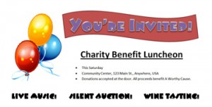
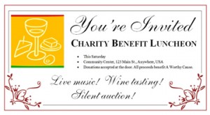
Here’s another example, using two invitations created in Microsoft Word for a (fictional!) benefit luncheon. They both convey the same basic information and have mostly the same layout, but each projects a different tone. Which do you think is more suitable for attracting an upscale, affluent crowd? What about for a casual, fun-loving group?


There’s all kinds of marketing research out there that goes into great detail about which combinations of colors, word choices, graphics and typefaces lend themselves more readily to attracting certain target audiences. I won’t bore you with that here. Plus, design trends and people’s preferences are ever-changing. But here are a few general guidelines to get you started:
- Youthful: Emphasis on the unexpected. Bright colors sometimes combined in unconventional ways (but still pleasing to the eye!); bold, sans serif typefaces; big graphics or images.
- Elegant: Emphasis on clean lines. Simple color palettes such as a basic black, white and red; traditional serif typefaces with script accents.
- Professional: Emphasis on information. Conservative use of color; few extraneous graphic elements except for those that directly illustrate the content; traditional page organization such as a two- or three-column format; easy-to-read typefaces.
- Casual: Emphasis on fun. Light colors, pastels; decorative typeface accents; graphic elements can be whimsical or have a hand-drawn look.
- Genre: Emphasis on the expected. Colors, typefaces and other design choices follow the standards for the genre. You’d expect a flier for a Goth-rock concert to look dark and brooding with calligraphic typeface accents, but a roots-rock act might go with earth tones and more traditional typefaces. Off-genre elements can work well as a “surprise” or pop of color, but they shouldn’t overwhelm everything else.
Move on to Commandment 2: Thou Shalt Know Thy Purpose
