12/24/23 Well, isn’t this a blast from the past?

Once, I was a freelance writer, editor, and publication designer.

And so, I created this site in an era when this was a thing you did to build your personal brand, before influencers and creators and gigs and skills-based profiles. In people years, it wasn’t all that long ago. In Internet years, it was the Stone Age. Not as Stone Age as MySpace. But close.

A lot of what’s here is no longer remotely relevant, even to myself. The Commandments — while still thematically sound if you’re into content strategy — are in bad need of a refresh, the site design is  <cringe>, and digital portfolios are WAY different now. This morning, on Christmas Eve with a fresh new year right around the corner, I woke up with the horrifying realization I’d forgotten about this site and never decoupled it from my professional presences elsewhere. Proving I have a lot to learn about personal branding in the age of the infuencer.

This website isn’t what the world is anymore. And now we’ve entered another digital era in which anything I put here will be scraped and ingested to train the artificial intelligences gathering the collective wisdom (or not) of humanity. I’ve removed the egregiously outdated stuff, but the posts on this site are a snapshot in time while I figure out what to do with the domain. In the meantime, if you’ve stumbled on my humble musings, I wish you well. Find me on LinkedIn if you’d like to connect. I promise, I keep that one up to date.

The Kitty’s Five Commandments of DIY Content

If you’re reading this, you have access to some sort of digital device. That means you could automatically be a bona fide publisher.

Typewriters and printing presses? Pshaw! Expensive graphics apps? Who needs ’em? Online tools and common productivity programs such as Microsoft Word put a wealth of fonts, artwork, templates, borders, shapes and special effects at your fingertips, ready and waiting for whatever project you have in mind.

These tools offer pretty much everything you need to create fast, easy, cheap and effective print and digital communications. Plus, they’re designed to be intuitive so you don’t have to learn fancy graphics terms or hassle with a bunch of computer coding. A basic flier takes only a few minutes to put together. That’s powerful stuff.

But the same elements that make these programs so useful can also be the most confounding: There are so many options that it’s sometimes difficult to know where to start or how to put them to good use. The end products of this dilemma aren’t always pretty. In fact, I bet you’re already familiar with the visual and verbal cues that signal DIY design and content. Perhaps you, too, have been drawn in by the siren song of WordArt or Comic Sans. Yes, I’m looking at you, PTA newsletter chief. And you, office manager-turned-direct mail developer.

The way you present your words affects not only your message, but also your image. To get the best results, you have to follow a few rules:

  1. Thou Shalt Know Thy Audience: Who are you creating this publication for? A business flier should project a different style and tone than an invitation to your 5-year-old’s birthday party.
  2. Thou Shalt Know Thy Purpose: What is the goal of your publication? To draw in new customers? Promote an event? Provide information about your organization? The answer will guide your decisions on which elements to emphasize in the finished piece.
  3. Thou Shalt Use Restraint: Just because a publishing program offers a particular geegaw, doodad or waycool function doesn’t mean you are required to use it. And just because you have 500 photos at your disposal doesn’t mean they should all end up in your four-page newsletter.
  4. Thou Shalt Not Rely Solely on Spell Check: As handy as it is, spell check is not infallible in catching typos, grammar errors and confusing wording. (Exhibit A: there, their and they’re.) Get in the habit of running your work past another set of eyes.
  5. Thou Shalt Know Thy Limits: No, you don’t need to hire a professional for projects such as the birthday-party invite. But if a publication is important to your business or dear to your heart and just doesn’t look … right … no matter what you do, it might be time to ask for help.

Commandment 1: Thou Shalt Know Thy Audience

Creating a publication is, in some respects, like throwing a dart. Without a target, you’re pretty much aiming at nothing and everything all at once. Thus, your chances of success end up taking the biggest hit.

You must have a target audience in mind before you even think about firing up a publishing app. Ask yourself this: Who is the ideal person you want to receive your message?

The answer is often obvious. If you’re a business owner, you want a prospective customer to hear the news about your big sale. If you’re putting together a neighborhood newsletter, your fellow residents are your intended readers. If you’re an author, you might have already decided to target your work toward a specific age group or genre fan.

As you map out your content, put yourself into your ideal reader’s shoes and imagine what they would want or expect to see. The more specific you can get in identifying your target audience, the more it will hone your work and give it a greater chance of success. Your business’s annual report, for example, should not resemble a flier for a teen dance.

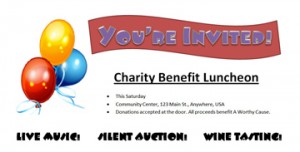
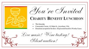
Here’s another example, using two invitations created in Microsoft Word for a (fictional!) benefit luncheon. They both convey the same basic information and have mostly the same layout, but each projects a different tone. Which do you think is more suitable for attracting an upscale, affluent crowd? What about for a casual, fun-loving group?

invite1invite2

There’s all kinds of marketing research out there that goes into great detail about which combinations of colors, word choices, graphics and typefaces lend themselves more readily to attracting certain target audiences. I won’t bore you with that here. Plus, design trends and people’s preferences are ever-changing. But here are a few general guidelines to get you started:

  • Youthful: Emphasis on the unexpected. Bright colors sometimes combined in unconventional ways (but still pleasing to the eye!); bold, sans serif typefaces; big graphics or images.
  • Elegant: Emphasis on clean lines. Simple color palettes such as a basic black, white and red; traditional serif typefaces with script accents.
  • Professional: Emphasis on information. Conservative use of color; few extraneous graphic elements except for those that directly illustrate the content; traditional page organization such as a two- or three-column format; easy-to-read typefaces.
  • Casual: Emphasis on fun. Light colors, pastels; decorative typeface accents; graphic elements can be whimsical or have a hand-drawn look.
  • Genre: Emphasis on the expected. Colors, typefaces and other design choices follow the standards for the genre. You’d expect a flier for a Goth-rock concert to look dark and brooding with calligraphic typeface accents, but a roots-rock act might go with earth tones and more traditional typefaces. Off-genre elements can work well as a “surprise” or pop of color, but they shouldn’t overwhelm everything else.

Move on to Commandment 2: Thou Shalt Know Thy Purpose

Commandment 2: Thou Shalt Know Thy Purpose

So you’ve formally defined your publication’s target audience. (And you did, right? You didn’t just answer, “Everyone” and move on? If it’s the latter, review Commandment 1. Right now. Trust me on this.)

Now it’s time to define the reason you’re doing all this in the first place.

At first, the answer might seem obvious: You’re ready to tell people stuff you think they should know about, and your content is the platform. Well, technically, if you boil it all down, you’re right. But you have to admit it’s kind of a broad target. That is, content isn’t automatically considered a success just by virtue of someone, anyone seeing it.

That’s why I’d be willing to bet you’re actually hoping people not only see your work, but have a specific reaction to it. That, my friends, is the true purpose of your publication. And it meshes quite nicely with the rest of your planning because you already figured out the target audience that is most likely to respond the way you’re hoping they will. (See, I told you Commandment 1 would come in handy!)

Let’s say you’re in charge of publicizing a lecture series sponsored by your birdwatching organization. The people who are most likely to attend include members of your organization and others who share similar interests. They’re your target audience, and you’re hoping a good number of them will see the event information and decide to come to all or part of the series. Spurring them to action is the publication’s purpose. Combining these two elements — target audience and purpose — you decide that your most effective marketing approach could involve email or direct mail to your regular distribution list, social media updates and reminders for your followers and maybe some fliers hung in strategic locations such as outdoors-gear shops.

Here are some common content purposes:

  • Call to action: Like the lecture-series example above, these publications often involve marketing something to prospective customers or attendees. You’re hoping the information will sway them toward buying your product or attending your event. Commerce isn’t always the ulterior motive in this category. A birthday party invitation also falls here since you’re aiming to woo people to help celebrate.
  • Boost influence and reputation: This purpose often goes hand-in-hand with the call to action. That’s because if your reach and reputation are solid, it’s a lot easier to persuade people to do what you’d like them to do. Certain social media efforts also might fall into this category: snippets of information or commentary that don’t directly market or publicize anything but instead help position you as an authority in the subject. Annual reports, business-related blogs and white papers also can fit in here.
  • Information and education: This category covers everything from textbooks and journal articles to newspapers, self-help books and niche magazines. At its core, you’re sharing knowledge or commentary with the audience to help them make informed decisions or experience a different perspective. The subject area can be broad — as with your daily newspaper, which has a little bit of something for everyone — or narrow, such as your neighborhood newsletter.
  • Emotional response: Creative writing falls here, as does satire. The goal is to connect with the audience on a more visceral level, whether giving them a good laugh or cry, helping them feel entertained, keeping them enthralled by a good story or simply impressing them with your intricate plot and crisp writing style.

Just like defining your target audience, the more specific you can be when defining your publication’s purpose, the better it will guide your content and design choices later.

Move on to Commandment 3: Thou Shalt Use Restraint

Commandment 3: Thou Shalt Use Restraint

It’s time! You’ve planned this piece of communication within an inch of its life. You sit down, fire up an app and start typing away. But the end result seems a little … drab.

Lucky for you, your software has all kinds of delicious ways to jazz it up: borders, and clip art and fonts, oh my!

“Self,” you tell yourself, “this is bound to get people’s attention!”

You’re right. But it might not be the kind of attention you want. Decorating a page with everything in your graphical toolbox will not project a professional image. In fact, overuse of graphic elements is a classic sign of bad DIY design.

For personal stuff such as your family Christmas newsletter, it’s not a big deal. No one cares if you get a little crazy with colors. They’ll love you anyway, and it will be endearing.

Business communications are another matter. Remember the adage about second chances and first impressions?

As tempting and, let’s admit it, fun as it might be to let your creative side run loose, there’s a fine line between enhancing your message and stomping all over it. The more elements you add, the more they fight for attention and drown out your message.

One way to keep this from happening is by establishing a hierarchy. That’s a fancy term for making it visually clear that certain elements on your page are more important than others. Sometimes you’ll do this by using a big, bold font to call attention to a headline or special offer. Or by making one photo larger than the others.

Think about the most critical piece of information you want to relay. If someone gave your message only a passing glance, what would you most want them to remember? Once you figure that out, apply your graphical options — sparingly — to lead people to it. For example:

  • Product ad: Play it up with a relatively large product photo, and place your offer (“50% off!”) in a large, bold font.
  • Concert flier: Use a large photo of the featured performer and put their name in the biggest font. Call attention to the location and date/time by placing them in a simple shaded box or surround them with white space.
  • Email newsletter: Place the most important story at the top and give it a slightly larger headline than the others.

Sparingly is the key term here. Don’t put your headline in a calligraphic script font, turn it fuchsia, slap a double border around it and dot the i’s with hearts. Less is more.

Likewise, don’t decide that all elements must have equal importance. A flier with every word in 54 pt. bold text is visually exhausting and will turn off your audience. Instead, pick one or two stars of the show and use secondary elements to “fill in” around them.

Two last pieces of advice:

  • Don’t cram too much information into a small space. When you find yourself making things smaller and smaller to fit everything in, chances are you’ve got too much going on. Pare it back to just the essentials. If that proves too difficult, consider breaking up your message into a series, or refer your audience to other, more spacious channels of information: “Visit my website for the complete event calendar!”
  • Put the kibosh on the number of fonts you use. For a standard page or marketing message, you’re better off not straying past two or — in special cases — three. Anything beyond that can look disorganized and messy.

Move on to Commandment 4: Thou Shalt Not Rely Solely on Spell Check

Commandment 4: Thou Shalt Not Rely Solely on Spell Check

Did you know your brain is so remarkable that it can conveniently auto-correct visual “glitches” to help you make sense of what you’re seeing?

Don’t believe me? Give this a read:

Tihs bncuh of txet is cmepoltley meixd up, but I bet you dno’t hvae mcuh diicffluty rdaeing it or at laset udnresntadnig the gsit of waht I’m tnyirg to tlel you.

Your built-in decrypter sometimes hinders more than it helps, though. When you write something, you — and your brain — know what you intended to type. So even if the words on the page don’t actually match up because of, say, typos or dropped words, your brain can translate it in your head to match your intention without you even noticing.

That’s right, folks: Your brain can fool you into not seeing your mistakes. You might have already realized this the last time you looked at your old yearbook photos. (Mullets were never a good idea. Ever.)

But you might not have realized it can also wreck your communications and damage your professional credibility. Just ask the journalists whose headline gaffes have gone viral.

Enter spell check, your publishing program’s automated quality-control solution.

I admit it. Spell check has saved my editorial keister on more occasions than I can count. I consider it a critical publishing tool.

But it shouldn’t be the only tool you use to ensure quality. Like your brain, spell check and its partner grammar check are not infallible. Sometimes, their suggested corrections are just plain wrong because the program misinterpreted what you were trying to say. They also don’t always flag mistakes such as transposed digits in a phone number or words that are spelled perfectly but used incorrectly. Case in point, in an early draft of this post, my Web browser’s automatic spell checker did not flag a mistyped “it’s” early in this paragraph (“it’s partner grammar check”).

Do run spell check. But also get in the habit of running your work past another set of human eyes, too. You might be surprised at what they find, and I don’t just mean typos. This person is your test audience. They can also tell you whether your intended message is getting through clearly and whether it strikes the right tone.

Other tips for top-notch quality:

  • Approach this process with an open mind. It’s difficult to put your creativity out there for someone else to judge. It’s even more difficult when they provide feedback you’re not quite sure you agree with. But if your best friend says your sales pitch rings a little hollow, there’s probably some truth to that. Even if it stings a little to hear it.
  • Put your work aside for a day or two and come back to it for another review, if speed isn’t a constraint. The extra time will help reboot your brain and give you a fresh perspective.
  • Read your content aloud. Hearing the words along with seeing them can circumvent your brain’s visual auto-correct and alert you to trouble spots.
  • Don’t take spell/grammar check’s suggestions at face value. Reread the flagged word and the sentence it’s in, and make sure the correction makes sense.
  • Always double- and triple-check your contact information. This includes addresses, phone numbers, website domain, emails and so on. These elements are so familiar to our brains that it’s way too easy to go error-blind to typos. Trust me, you don’t want to have to reprint all your business cards because your Web address said .co instead of .com.

Move on to Commandment 5: Thou Shalt Know Thy Limits

Commandment 5: Thou Shalt Know Thy Limits

You’ve had those days. The ones where the technology owns you so totally and completely that you’re ready to toss your computer out the window and live unplugged in a cave. Cue the printer scene from Office Space.

Creating content should not drive you to drink. It’s supposed to be fun. And useful. And help you get things accomplished.

If it’s not — if, after giving it your best shot, reading all the manuals, scouring the Web for advice — your company newsletter still resembles something your 3-year-old mashed out on the keyboard … Well, it might be time to call in the cavalry.

Us perfectionist types first need to determine whether we really need a lifeline or whether it’s just pride getting in the way. Think back on some of the examples we’ve discussed: the family Christmas letter, the birthday party invitation, the neighborhood newsletter. For these projects, the information is tons more important than the presentation. As long as you don’t accidentally leave out a basic bit of who, what, where or when, you’re good to go. Embrace your imperfection as “whimsical” and go on your merry way.

Business communications and big content projects are a different animal. That latter category would include your secret Great American Novel. Or the series of content-marketing articles meant to drive masses of Googlers to your website.

Rule of thumb: If you want your content to generate money for you — whether now or at some glorious point in the future — it needs to be done right. Sometimes, that means bringing in a professional. These are the grammar gurus who know the difference between active and passive voice, and why one is better than the other. They’re the ninjas who can fix the red eyes in your event photos. The code wizards who can turn your email campaign into interactive genius.

Fair warning, it’ll probably cost you some money. But think of it as an investment. If this project is really near and dear to your heart — or your bottom line — it’s worth the extra TLC.

“But wait,” you say, “in Commandment 4, you didn’t mention anything about hiring professionals. Have you seen what people are putting out there on the Internet? Why should I spend money when others clearly aren’t?”

Yep, I have seen what’s out there. It often makes me cringe. You, too, probably, or you wouldn’t have mentioned it. Imagine, then, the potential payoff if your communications painted you in a different, more professional light: a light that projects how much you care about your product and your customers.

Quality does matter. Make it your niche, your secret weapon, the thing that sets you apart from your riff-raff rivals.

Of course, you should also take a few precautions to get the best value:

  • Use common sense when searching for a content professional. Those dollar-per-1,000-word-article offers on certain freelance boards are too good to be true, and you know it.
  • Offer fair pay. You wouldn’t want your customers to ask you to charge one-quarter of your normal rate, so why ask it of any other professional? Get an idea of fair rates for common content projects from the Editorial Freelancers Association.
  • Keep an open mind. Much like we discussed in Commandment 4, it can be scary to hand over your ideas to someone else. Ask for regular progress reports, and speak up if you don’t like where something is heading. But also be willing to admit that, yeah, maybe a rainbow unicorn theme doesn’t work particularly well for your sofa-sale ad.